
What is media query?
In CSS3 new CSS technique is introduced called as Media Query.Media query is vital tool used for designing websites & web applications.Most frequently used query is max-width.It can be used as alternative for fluid hybrid design.
If a specific condition is valid it uses the @media rule to include block of CSS properties.
Example
If the browser window is 500px or smaller, the background color will be red:

Add Breakpoints
When you make a web page with rows and columns, and it was responsive, but it did not look good on a small screen.
That time we can use Media queries.
In following condition when we add breakpoints where some part of design will start behaving differently on each and every side of breakpoint.
Let see CSS Media Queries for Mobile, Tablet, Laptops, and Desktop.
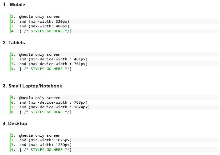
Instead of checking type of device look at the capability of device & check for following things For example:
1) height & width (of the browser window)
2) Resolution
3) device width and height
4) Orientation - for example is a phone/mobile in landscape / portrait mode?
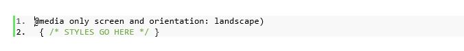
Example
The webpage in landscape mode.
ADD MEDIA QUERIES JAVASCRIPT
CSS3 media queries doesn’t support many internet browsers like Internet Explorer 8 or older versions. To enable it add the css3-mediaqueries.js Javascript file.

ADD MEDIA QUERIES CSS
Create a new css stylesheet for the media queries.

2)Purpose of using media query?
Now-a-days different screen sizes exist across phones, tablets, desktops, game consoles, TVs, Laptops. Screen sizes are always changing, so it's important that your site should be flexible to any screen size, today or in the future.
Screen resolution nowadays ranges from 320px (iPhone) to 2560px (large monitor) or even higher. Users no longer just browse the web with desktop computers. Users now use mobile phones, small notebooks, and tablet devices such as iPad or Playbook to access the web. So the traditional fixed width design doesn’t work anymore. Web design needs to be adaptive. The layout needs to be automatically adjusted to fit all display resolution and devices.
3)Benefit
• Smooth Navigation
• Easy Reading
• Reduces Scrolling & zooming
• Excellent User Experience